

Packaging Development
Nestlé wanted to launch an innovation from one of their most popular chocolate products: Galak.
The idea was to mix the white chocolate with little bits of chocolate cookie.
In The Galak Brand, the Milk is the main element to stand out and so their Galak Cow character, so, we needed to find a way to put together the Milk, The product, and the elements of the Brand.

LOGO CONCEPTS
At first, I needed to create the Sub Logo for this innovation. So I played with different types and I found these with the perfect shape and thikcness. In the first one, I made a few edition in the type and added some bits representing the cookie. In the second one, I wanted to show some joy and fun playing with the letters 'O' of the word cookie, a few changes in the type were made too.
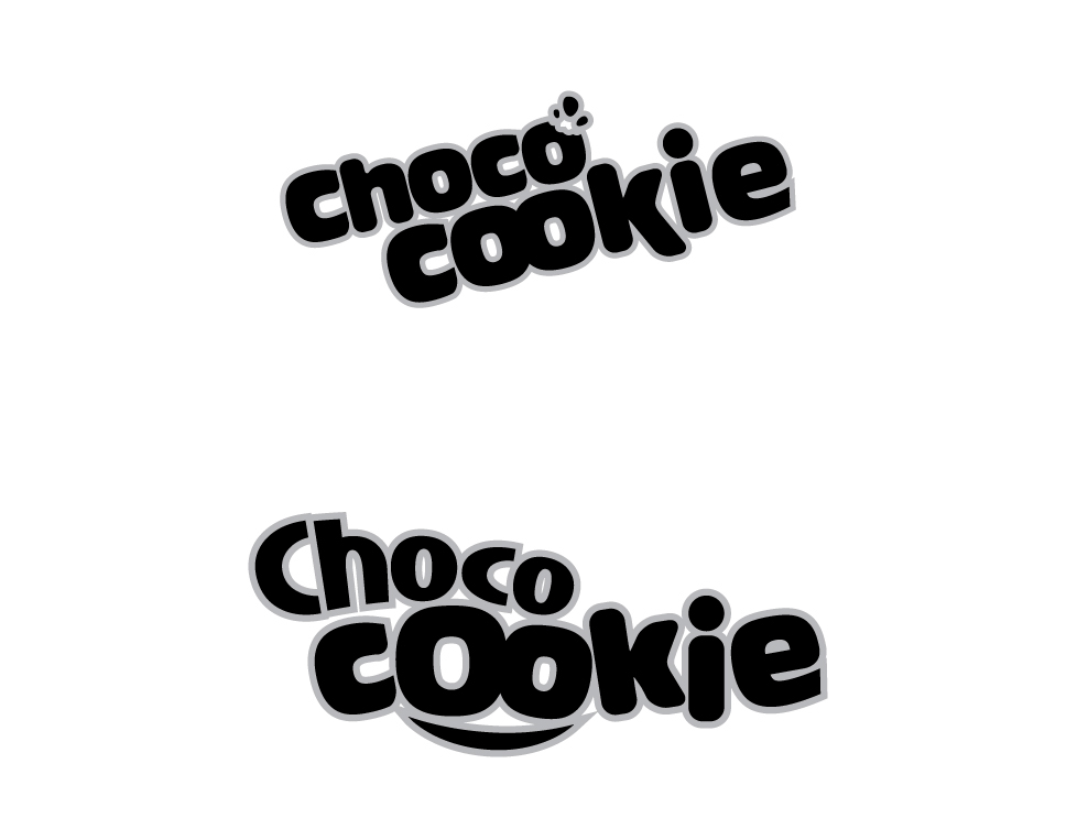

Logo Options colorized.
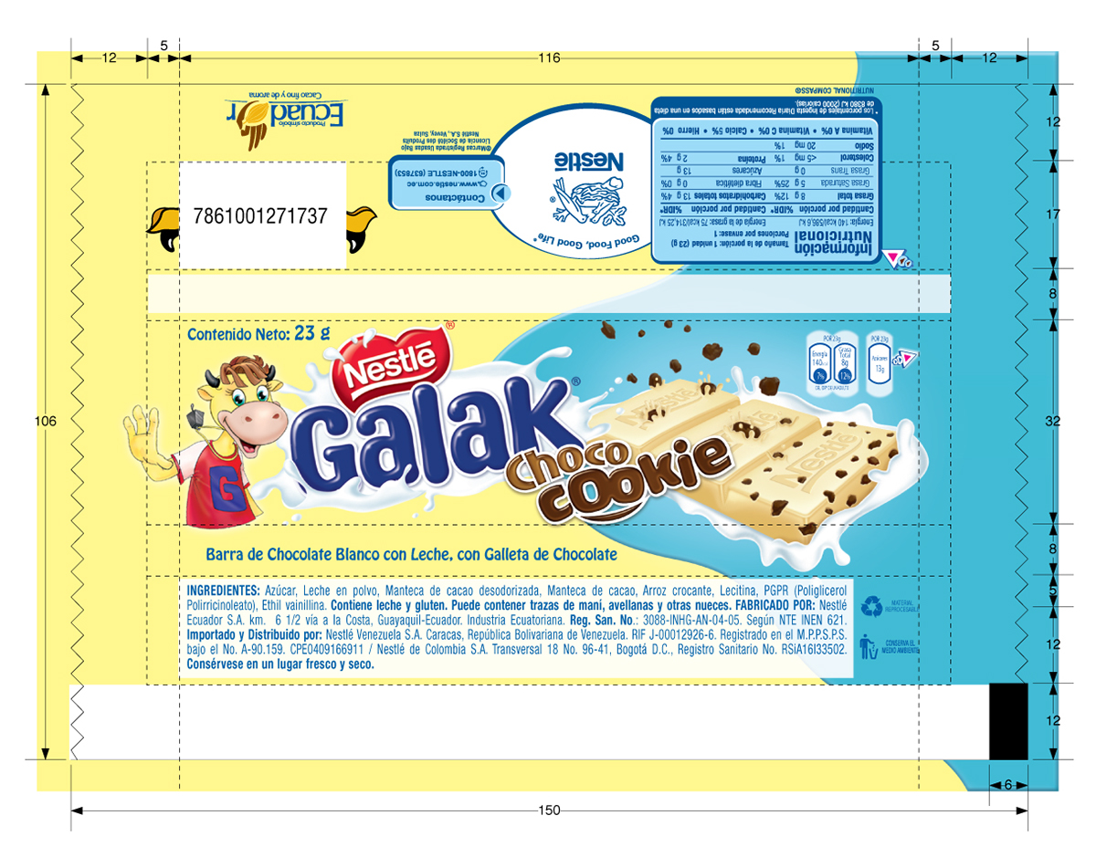
THE PACKAGING
This graphic concept would be used in several packaging. 23 g, 100 g, and the Multipacks, so we decided to beging designing the concept to the very smaller package in the family. The 23 g, because is the one who you can purchase by individual to eat. We need to make this one very special and very attractive.
The Nestlé's request was to stand out that this kind of Galak is an innovation. A new product very different from the regular Galak, but part of the family. I made my concepts thinking about gathering 50% of new elements, and 50% of Regular Galak Brand Elements.
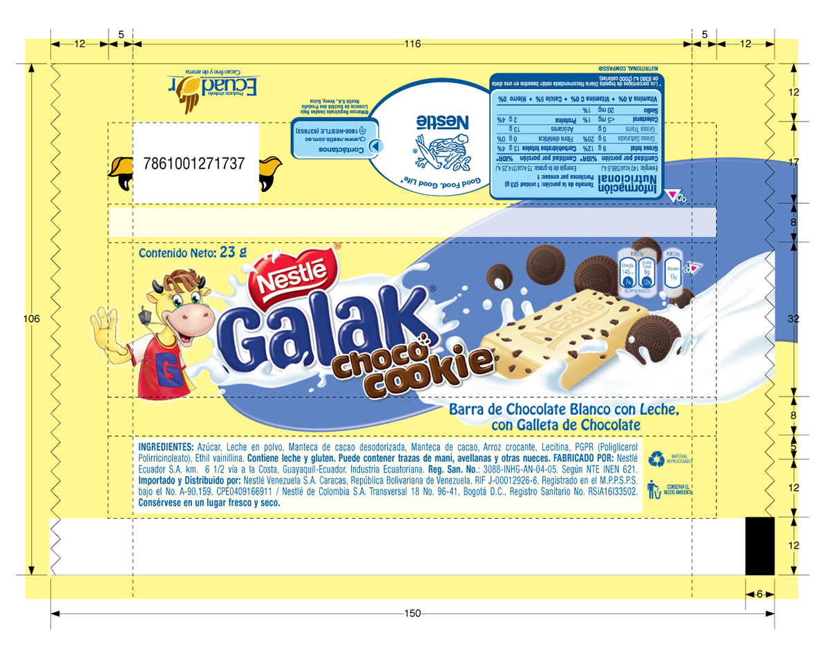
In this option I put together the milk and the cookies and the chocolate bar. My first Idea was to create a visible difference between the regular galak and this innovation by a color. I painted an example of the chocolate bar with the bits of cookie inside but visible, Put some cookies around and then I put a color shape full of energy and rythim behind all the elements to achieve this. I used my first option of the Choco Cookie Logos.
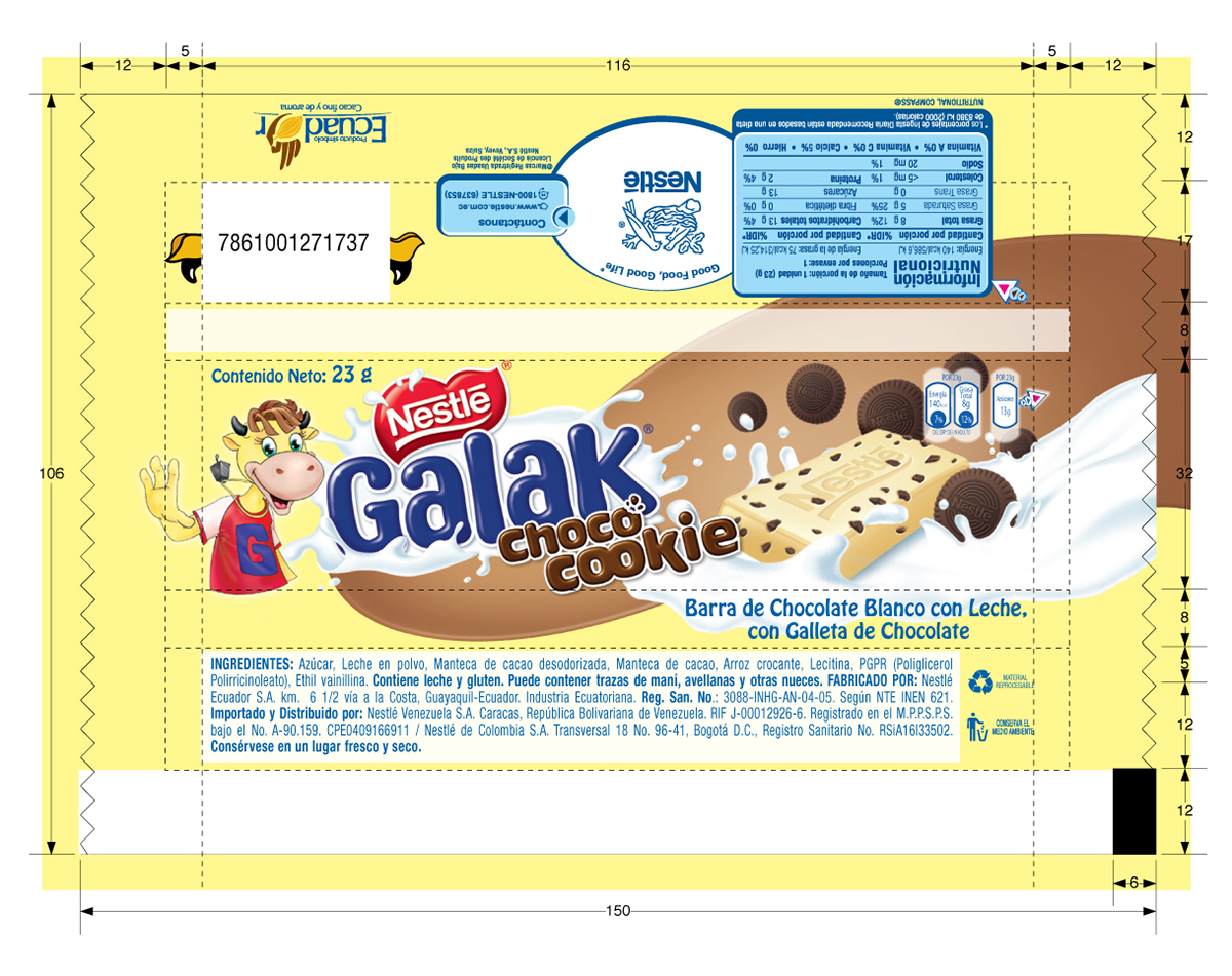
Same Option but with a Different Color.

I wanted to see if the elements worked by themselves without any color shape, But this option was inmediately dismissed.

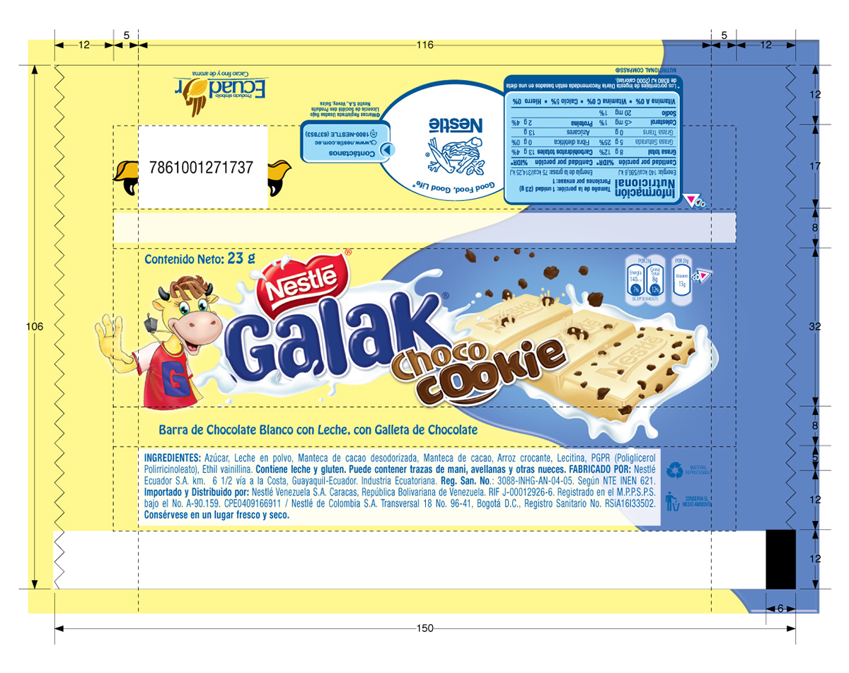
In this option I tried a new color shape and a new way to show the mix of the chocolate bar and the cookie bits.
The concept was to make the cookie bits look like meteors falling into the chocolate making splashes to show some indulgence in the bar, surrounding by a splash of milk. The turquoise color was a practical intend to mix some cyan with the regular yellow from galak, so the combination worked perfectly and make great contrast to help the product visibility.
To this option I used my second option of the Choco Cookie Logos.
Same option but with a different color. I removed some cookies behind to make it more simple and clear.
This was the client final choice from the options, with the second option of the Choco Cookie logos but without the cookies behind as the purple one.

This was my sketch for the chocolate bar with the cookie meteors falling and the visible bits in the front.
External Illustration of the chocolate bar
The final illustrations was developed by David Chung, our external supplier. He achieved a really natural look of the chocolate with the cookie bits and the little meteors of cookies got a really good looking falling into the chocolate bar. The milk splash around looks great too.


Another angle of the bar to make some other graphics.
The final Result
I needed to put the final elements together and I found some problems in the layout, because of the legal elements from the Nutrition facts and such, so, I use the other angle of the bar and make the color shape simpler.


The 3D look of the final packaging.
The product was a very big success, not only because of the graphical solutions, but for this really good tasty flavors. They were a good combination of results.


